Visual Layout Choices and Their Measurable Influence on Digital Reward Entry Completion
Greta Coleman · Jun 20, 2026
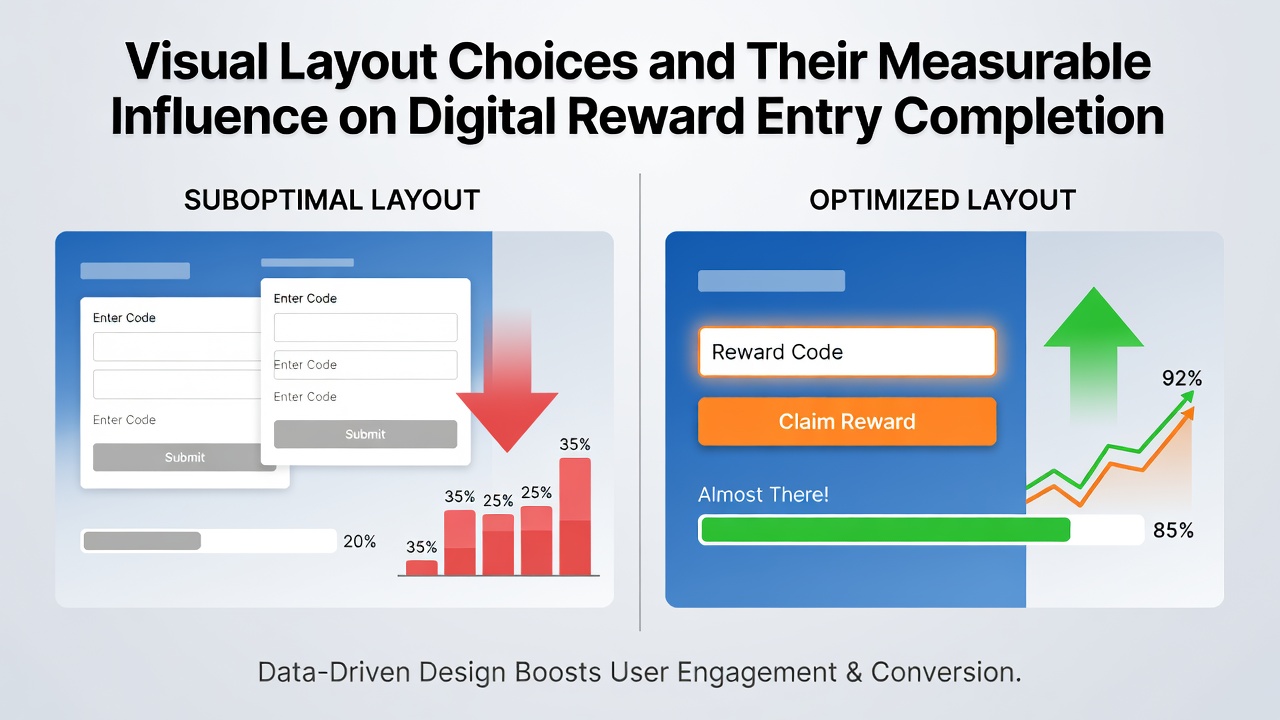
Visual Layout Choices and Their Measurable Influence on Digital Reward Entry Completion
Digital reward entry systems rely on layout decisions that shape how participants move through forms and submission flows, with measurable effects on completion rates tracked across multiple platforms. Researchers have documented these patterns through A/B testing and analytics data gathered from large-scale online contests, revealing consistent correlations between specific design elements and user behavior. Studies conducted by academic institutions and industry analysts show that adjustments to spacing, alignment, and element positioning can shift completion percentages by double-digit margins in controlled environments.
Typography Decisions and Their Documented Effects
Font selection and sizing influence reading speed and error rates during form completion, according to findings from usability labs that monitor eye-tracking metrics on reward entry pages. Sans-serif fonts at 16 pixels or larger tend to reduce abandonment when participants scan instructions or terms, while inconsistent sizing across fields correlates with higher dropout numbers in aggregated logs. Data from campaigns running into June 2026 indicates that platforms using uniform typography across mobile and desktop versions recorded steadier progression rates through multi-step entries compared to those with mixed font families.
Color Usage Patterns in Submission Interfaces
Contrast ratios between text, backgrounds, and interactive elements affect visibility and click-through sequences, with analytics platforms logging precise heat-map distributions on entry screens. High-contrast primary buttons positioned after input fields register elevated interaction volumes, whereas low-contrast secondary options for optional fields show reduced engagement in the same datasets. Observers note that color palettes aligned with accessibility standards produce broader participant reach without requiring separate compliance adjustments.
Button Placement and Form Flow Analysis
Positioning of submission controls relative to input clusters determines the sequence of actions users complete before finalizing entries. Forms that place action buttons immediately below required fields demonstrate higher sequential completion in server-tracked sessions, while buttons offset to side columns or footers appear in lower percentages of finished submissions. Research indicates these layout variations interact with device type, producing distinct patterns on tablets versus smartphones during simultaneous campaign monitoring periods.
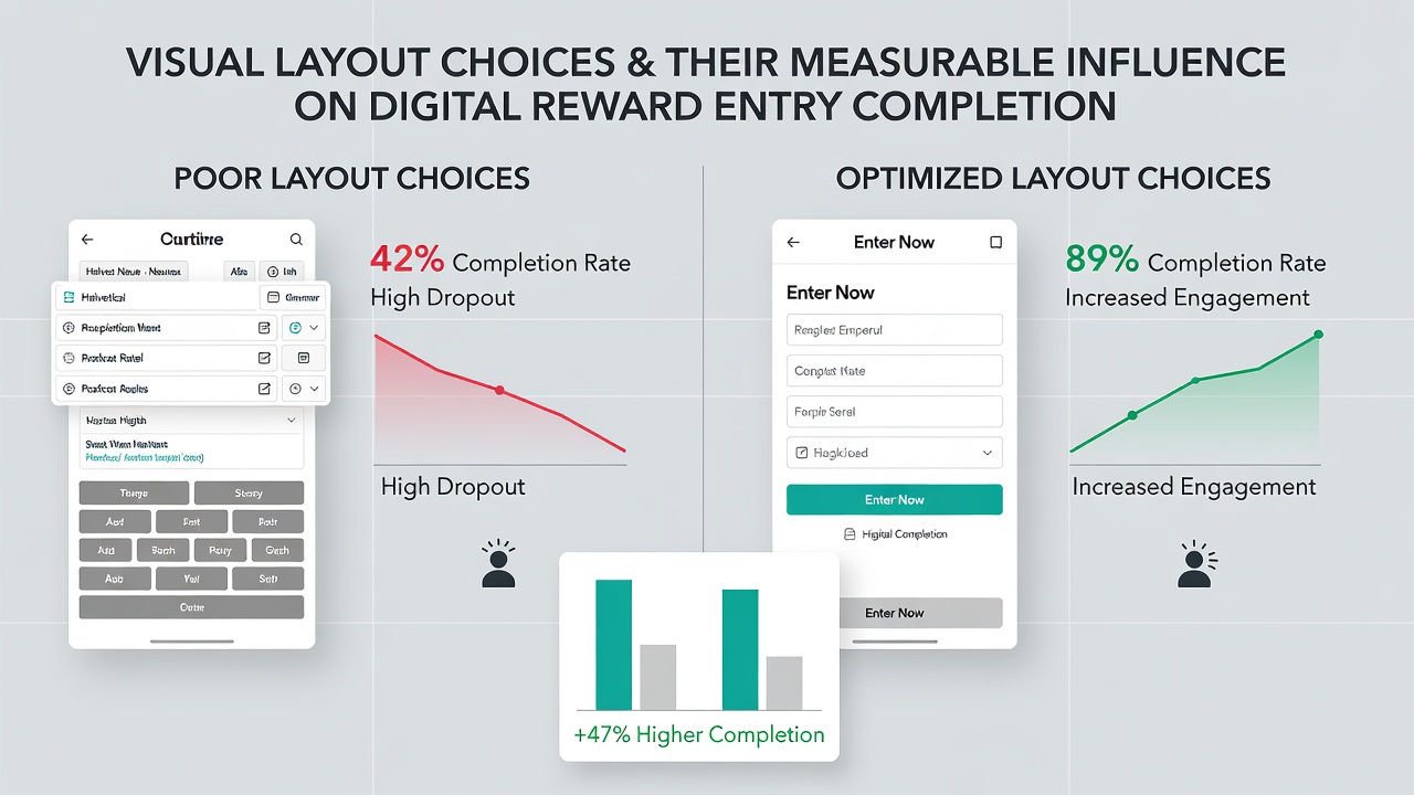
Navigation cues such as progress indicators and section dividers further guide participants through longer forms, with data logs showing fewer interruptions when visual separators maintain consistent spacing. Those who've examined aggregated entry archives report that forms lacking these cues experience clustered drop-offs at midpoints, particularly in multi-page reward programs.
Mobile Responsiveness Metrics
Adaptive layouts that resize and reorder elements based on screen dimensions maintain completion consistency across devices, according to performance reports compiled by digital analytics providers. Fixed desktop layouts adapted poorly to smaller viewports register measurable declines in finish rates, while fluid grids preserve field visibility and touch-target sizing. Platforms that implemented responsive adjustments ahead of peak entry periods in 2025 and 2026 observed stabilization in daily submission volumes regardless of access method.
Empirical Evidence from Industry Reports
Analyses published by the Nielsen Norman Group detail how visual hierarchy influences task completion in form-based interactions, with specific attention to reward and registration flows. Additional findings from the Canadian Institute for Health Information's digital interface studies extend similar observations to public-facing entry systems, confirming that layout consistency reduces cognitive load during repeated submissions. These sources provide quantitative benchmarks drawn from large participant pools without relying on single-platform anecdotes.
Conclusion
Layout elements including typography, color contrast, button positioning, and responsive adaptation produce measurable variations in digital reward entry completion across tracked campaigns. Data compiled through June 2026 continues to map these relationships through ongoing testing, supplying platforms with actionable benchmarks for interface refinement. Continued monitoring by research organizations and analytics teams supplies updated figures that reflect evolving device usage and participant expectations in reward programs.