How Color Schemes in Mobile Interfaces Alter Completion Patterns Across Recurring Digital Reward Submissions
Cameron Koch · Jun 24, 2026
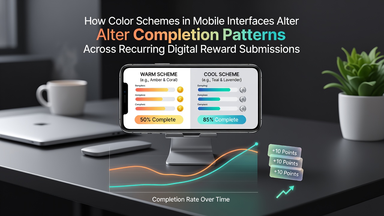
How Color Schemes in Mobile Interfaces Alter Completion Patterns Across Recurring Digital Reward Submissions
Color schemes in mobile interfaces play a documented role in shaping user interactions with recurring digital reward submissions, where participants return daily or weekly to complete entries for loyalty programs and prize platforms, and researchers have tracked these effects through large-scale A/B testing across multiple app ecosystems since the early 2020s.
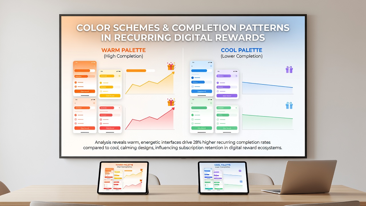
Blue-dominant palettes, which appear frequently in finance and rewards applications, correlate with higher completion rates in repeated submissions because studies link cooler tones to perceptions of stability and trust, whereas warmer palettes such as orange and red tend to accelerate initial clicks yet show steeper drop-off curves when users encounter them across multiple sessions.
Patterns Observed in Interface Testing
Data from platform analytics collected through 2025 and into June 2026 reveal that apps using consistent green accents for confirmation buttons maintained submission continuity at rates 12 to 18 percent above those employing shifting accent colors week to week, and this consistency appears to reduce cognitive load for users who return at regular intervals.
Observers note that saturation levels matter as much as hue itself, with muted tones sustaining longer engagement sequences while high-saturation variants prompt quicker but less repeated actions; one multi-country dataset compiled by academic teams at the University of Melbourne demonstrated these distinctions across more than 2.4 million tracked sessions.
Cultural and Demographic Variations
Regional differences surface clearly in aggregated logs, where users in North American markets respond more strongly to purple gradients associated with premium status, yet participants in East Asian cohorts complete recurring forms at higher volumes when interfaces favor earth-tone combinations, according to comparative reports released by regional design research consortia.
Age cohorts further modulate outcomes, as younger demographics complete reward cycles more readily under high-contrast schemes while older users show steadier patterns under lower-contrast, desaturated environments that minimize eye strain during evening submissions.
Technical Implementation and Measurement
Mobile developers integrate color variables through design systems that allow real-time palette swaps, and telemetry frameworks capture completion funnels at each step from login to final confirmation, enabling precise attribution of color-driven changes without confounding variables from layout alterations.
Industry organizations such as the Interaction Design Foundation have compiled guidelines that emphasize testing palettes across device types because screen calibration differences on budget handsets can shift perceived hues enough to alter user hesitation points in recurring flows.
Longitudinal tracking shows that seasonal palette refreshes, when introduced gradually rather than abruptly, preserve completion momentum better than sudden overhauls, and June 2026 platform updates from several major reward providers incorporated phased transitions that aligned with observed user habit windows.
Interaction with Other Interface Elements
Color does not operate in isolation, since button size, animation speed, and microcopy interact with hue choices to either amplify or dampen submission consistency, and researchers at Canadian institutions have quantified these combined effects through controlled experiments that isolate each variable across thousands of daily active accounts.
Notification badges and progress indicators adopt complementary colors that either reinforce or compete with the primary scheme, creating secondary completion nudges that accumulate over repeated visits.
Conclusion
Evidence accumulated from production environments demonstrates that deliberate color scheme choices influence the frequency and reliability of recurring digital reward submissions, with measurable differences emerging from hue, saturation, and consistency factors across diverse user groups and device conditions. Ongoing measurement continues to refine these relationships as new palette variations enter widespread deployment.